Configure a navbar for your project. The navbar appears across the top of the published project. You can configure the links and groups of links that appear on the navbar of your site, or hide the navbar altogether. The navbar is a good location for top-level category or frequently-used links.
| Option | Type | Description |
|---|---|---|
| items | Item | Group | List of items in the Navbar. |
hide | boolean | Specifies if the navbar should be hidden. Default: The |
| Option | Type | Description |
|---|---|---|
| group | string | REQUIRED. Name of the group. |
| groupTranslationKey | string | Specifies the group name key used for localization. |
| items | Item | REQUIRED. List of items. The navbar for the default theme may only have one level of depth to groups. |
| linkedSidebars | [string] | List of relative paths to sidebar files. This option adds the navbar item to a sidebar's breadcrumbs. Only effective for top-level navbar items. |
| icon | string or srcSet | Either:
|
| external | boolean | Open link in new browser tab. Default is false. |
| page | string | Relative or absolute path to the file (extension included) which represents the page to link to. Mutually exclusive with the href option. |
| href | string | URL to link to. Mutually exclusive with the page option. |
| Option | Type | Description |
|---|---|---|
| label | string | Link text displayed for the item. |
| labelTranslationKey | string | Link text key for the item used for internationalization. |
| icon | string or srcSet | Either:
|
| page | string | CONDITIONALLY REQUIRED. Relative or absolute path to the file (extension included), or a full route slug which represents the page to link to. Mutually exclusive with the href option. If you don't include a label option, the link text matches the level 1 heading of the page. Examples: ./index.md, /docs/tutorial.md, ../../glossary.md, /info#admonition, ./test.md#rename. |
| href | string | CONDITIONALLY REQUIRED. URL to link to. Mutually exclusive with the page option. If you don't include the label option, the link text matches the value of href. Examples: https://redocly.com, https://www.openapis.org/. |
| external | boolean | Open link in new browser tab. Default value: false. |
| linkedSidebars | [string] | List of relative paths to sidebar files. This option adds navbar item to sidebar's breadcrumbs. Only effective for top-level navbar items. |
| additionalProps | object | Additional properties for the navbar item. Pass arbitrary data that can be accessed in custom theme components. To learn how to customize theme components, see: Eject components. |
| Option | Type | Description |
|---|---|---|
| srcSet | string | Comma-separated list of icon file paths and corresponding color modes. When configured, the icon changes when the user switches between color modes. |
The following is an example configuration for a simple flat navbar.
navbar:
  items:
    - page: index.md
      label: Home
    - page: docs/getting-started.md
      label: Getting Started
    - page: api-reference.yaml
      label: API Reference
    - label: Support
      href: https://support.example.com
      external: true
The following is a screenshot of that navbar.

The following example shows a comprehensive navbar configuration for a documentation site with multiple sections, localization support, and external links:
navbar:
  items:
    - page: index.md
      label: Home
      labelTranslationKey: nav.home
    - group: Documentation
      groupTranslationKey: nav.docs
      items:
        - page: docs/getting-started.md
          label: Getting Started
          labelTranslationKey: nav.getting-started
        - page: docs/guides/index.md
          label: Guides
          labelTranslationKey: nav.guides
        - page: docs/tutorials/index.md
          label: Tutorials
    - group: API Reference
      items:
        - page: users-api.yaml
          label: Users API
        - page: orders-api.yaml
          label: Orders API
        - page: webhooks-api.yaml
          label: Webhooks API
    - page: changelog.md
      label: Changelog
    - label: Support
      href: https://support.example.com
      external: true
icon: ./images/support-icon.svgFor sites with multiple products, organize content using groups and linked sidebars:
navbar:
  items:
    - page: index.md
      label: Home
    - group: Products
      items:
        - page: product-a/index.md
          label: Product A
          linkedSidebars:
            - product-a/sidebars.yaml
        - page: product-b/index.md
          label: Product B
          linkedSidebars:
            - product-b/sidebars.yaml
    - page: support.md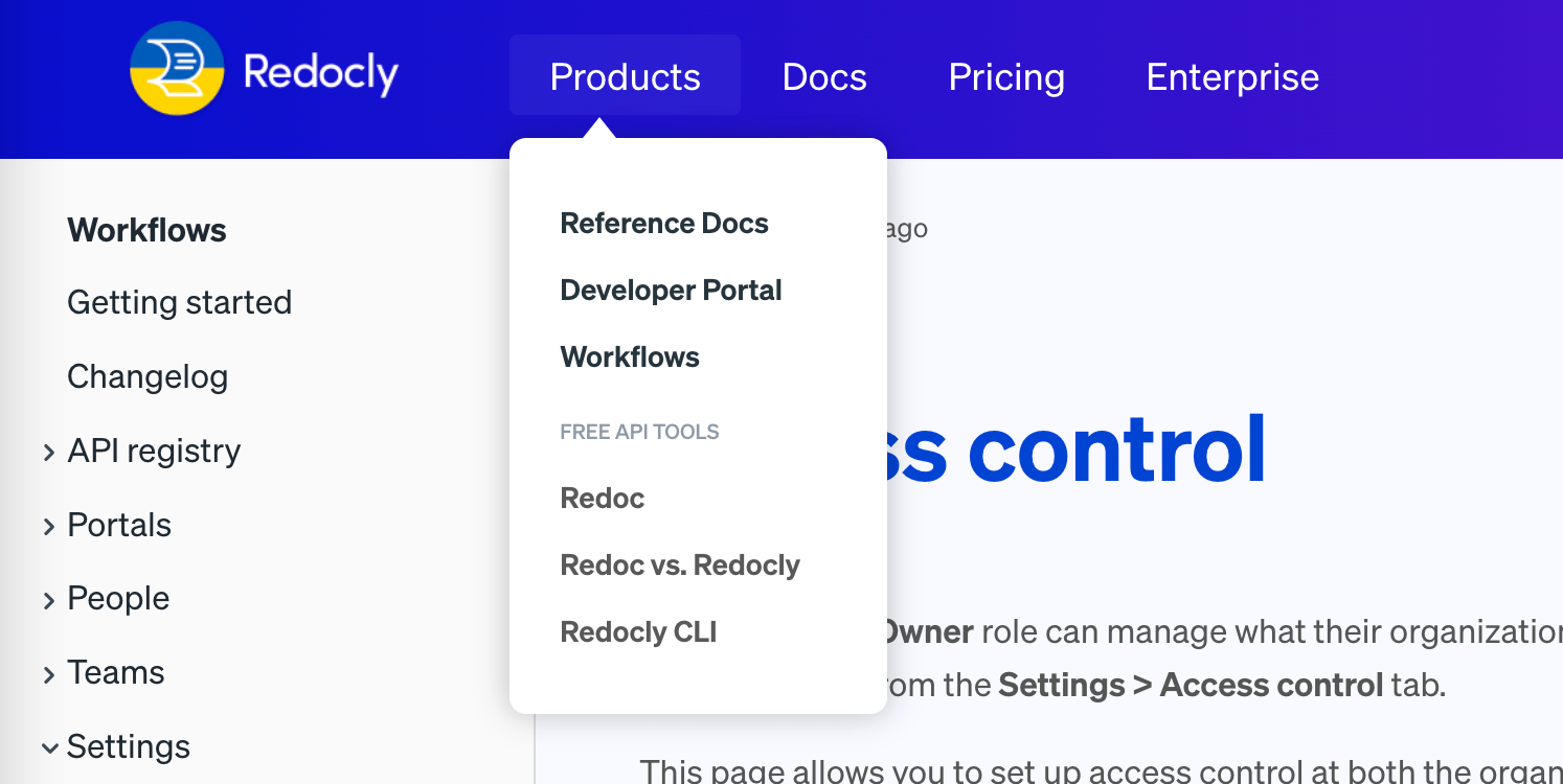
label: SupportThe following is an example of a dropdown menu with visual separators for better organization:
navbar:
  items:
    - group: Products
      items:
        - page: platform/index.md
          label: Platform
        - page: api-gateway/index.md
          label: API Gateway
        - separator: Developer Tools
        - page: cli/index.md
          label: CLI
        - page: sdk/index.md
          label: SDK
    - label: Pricing
      page: pricing.md
    - label: Enterprise
      page: enterprise.md
The following is the screenshot of the navbar.
To hide the navbar globally or on specific pages:
# Hide navbar on all pages
navbar:
  hide: true
Or in page front matter:
---
navbar:
  hide: true
---Use additionalProps to add custom data to navbar items:
navbar:
  items:
    - page: index.md
      label: Home
      additionalProps:
        description: Main landing page
Custom theme components can access these properties to display additional information or implement custom behavior.
- Navigation elements - Overview of all navigation components and patterns for creating comprehensive site navigation structures
- Footer configuration - Configure the footer navigation with links, copyright information, and organizational elements
- Logo configuration - Configure the logo that appears in the navbar with brand customization and display options
- Localization - Configure navbar labels and text for multiple languages to support international audiences
- Front matter configuration - Use front matter to show or hide the navbar on individual pages for custom page layouts
- Configuration options - Explore other project configuration options for comprehensive documentation and platform customization