Code walkthrough tag
Use code walkthroughs to interactively explain complex code examples to your users. Code walkthroughs combine steps with explanatory text and interactive code highlighting on downloadable code samples. As users select different steps, the corresponding code from the code samples highlights, drawing their focus where you want it.
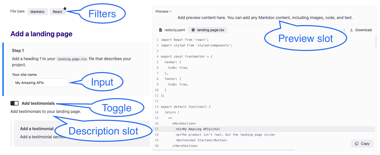
Code walkthroughs are presented on the page as two distinct panels. The left panel displays the steps and explanations that guide users. The right panel includes downloadable code files that correspond to the steps displayed on the left panel.
Optional UI elements
Code walkthroughs include the following optional UI elements:
- Filter: If a filter is defined, the left panel displays a filter bar to allow users to filter the content.
- Input: An Input provides a text field for users to customize text in the code samples.
- Toggle: A toggle is a UI element on the left side panel that allows users to reveal additional content.
- Description slot: The description slot defines content that renders below the toggle regardless of the toggle state.
- Preview slot: If a Preview slot is defined, the right panel displays a preview accessible by the accordion above the right code panel.
The following screenshot shows a code walkthrough with filters, an input, a toggle with a description slot, and a preview slot:
Markdoc tags
Code walkthroughs are created using the following Markdoc tags:
- Code Walkthrough: This tag is the main tag that encompasses the other tags creating the code walkthrough interface.
- Step: This tag organizes individual steps of your walkthrough enabling you to bind them to
chunksin code snippets, highlighting those sections in the code as the users selects the steps. - Toggle: This tag adds toggles allowing users to control the visibility of the displayed content and code snippets.
- Input: This tag adds input fields to the code walkthrough allowing users to customize code samples to meet their use case.
Additionally, use conditions to selectively display parts of a code walkthrough based on context, and chunk annotations to control the highlighting behavior of code snippets.
Syntax and usage
Add an opening and closing code-walkthrough tag to wrap the other tags and create the two pane code walkthrough. The code walkthrough tag requires a filesets attribute that specifies which code files to display on the right side panel.
{% code-walkthrough
  filesets=[
    {
      "files": ["./node-project/request.js"],
      "downloadAssociatedFiles": ["./node-project/package.json"],
      "when": {
        "server": "Node"
      }
    }
  ]
  filters={
    "server": {
      "label": "Server",
      "items": [{"value": "Node"}, {"value": "Python"}]
    },
    "client": {
      "label": "Client",
      "items": [{"value": "Next.js"}, {"value": "React"}]
    }
  }
%}
  # Code Walkthrough Title
  Add steps and explanations here to guide users through the code.
  {% step id="step-1" heading="Step 1" %}
    Add step content here.
  {% /step %}
{% /code-walkthrough %}
To highlight sections of code in the sample code files in the right side panel when users select text in the left side panel, wrap content in the left side panel in a step tag with corresponding id attributes used in the code sample chunk annotations, as in the following example:
{% code-walkthrough %}
{% step id="add-text" heading="Add text to HTML file" %}
Add text to your HTML file.
{% /step %}
{% /code-walkthrough %}
Attributes
| Attribute | Type | Description |
|---|---|---|
| filesets | [Filesets object] | REQUIRED. A list of filesets used in the code walkthrough. Each filesets entry must have a list of files. |
| filters | Map[string, Filter object] | A map of category IDs to filter configurations Each filter configuration contains an object with an items list of objects that have a value property. Used to organize and conditionally display content. Example:{% code-walkthrough
filesets=[
{
"files": ["./code-walkthrough/index.md"],
"downloadAssociatedFiles": ["./node-project/package.json"],
}
]
filters={
"platform": {
"label": "Platform",
"items": [
{ "value": "ios" },
{ "value": "android" }
]
},
"language": {
"label": "Language",
"items": [
{ "value": "swift" },
{ "value": "kotlin" }
]
}
}
%}
{% /code-walkthrough %}when and unless conditions in a step tag or chunk annotations, as in the following example:{% step id="step-1" when={ "platform": "ios", "language": "swift" } %}
iOS-specific Swift code
{% /step %} |
Filesets object
Configure a filesets object to include files in your code walkthrough.
| Attribute | Type | Description |
|---|---|---|
| files | [string] | REQUIRED. A list of file paths to include in the walkthrough. |
| downloadAssociatedFiles | [string] | A list of file paths for files users can download but aren't part of the code walkthrough. |
| when | Conditions object | Conditions for when the files from the filesets are visible. |
| unless | Conditions object | Conditions for when the files from the filesets are not visible. |
Filesets example
{% code-walkthrough
  filesets=[
      {
        "files": ["./code-walkthrough/index.md"],
        "downloadAssociatedFiles": ["./node-project/package.json"],
        }
    ]
%}
{% /code-walkthrough %}
Filter object
Configure a filter object to organize content and provide users a UI element for displaying selected parts of the code-walkthrough.
| Attribute | Type | Description |
|---|---|---|
| label | string | The label displayed for the filter. |
| items | [Value object] | A reserved list of objects, each consisting of a "value" key and its value. This list renders as the items users can select to filter the walkthrough content. |
| when | Conditions object | Conditions for when the the filter is visible. |
| unless | Conditions object | Conditions for when the filter is not visible. |
Filter example
{% code-walkthrough
  filesets=[
      {
        "files": ["./node-project/request.js"],
        "downloadAssociatedFiles": ["./node-project/package.json"],
        "when": {
          "server": "Node"
        }
      }
    ],
    filters={
      "platform": {                    // filter ID
        "items": [
          { "value": "ios"},
          { "value": "android"}
        ]
      },
      "language": {                    // Another filter ID
        "items": [
          { "value": "swift", "when": { "platform": "ios" }},
          { "value": "kotlin"}
        ]
      }
    }
%}
...
{% /code-walkthrough %}
Value object
A reserved list of objects, each consisting of a "value" key and its value. This list renders as the items users can select to filter the walkthrough content.
| Attribute | Type | Description |
|---|---|---|
| value | string | REQUIRED. Value of the item. |
| when | Conditions object | Conditions for when the item is visible. |
| unless | Conditions object | Conditions for when the item is not visible. |
Conditions object
Provide conditions for when to display certain UI elements such as toggles or inputs. You can also add conditions for when to display content such as steps or code sample files when a filter is selected.
| Attribute | Type | Description |
|---|---|---|
| {toggle id} | boolean | True if toggle is enabled. |
| {filter id} | string | [string] | A single or list of filter ids. |
| {input id} | string | [string] | A single or list of input ids. |
Preview slot
Use the Preview slot to add media or other markup to the code walkthrough. The content you reference in the Preview slot renders in the right pane, together with code snippets.
You can use this optional element to show users an image "preview" of what they build in the course of the walkthrough.
Slot "preview" examples
{% code-walkthrough %}
  {% slot "preview" %}
    {% img src="./images/ticket.jpg" alt="Sample museum ticket" width="300" height="200" %}
  {% /slot %}
{% /code-walkthrough %}{% code-walkthrough %}
{% slot "preview" %}
<img src="images/ticket.jpg" alt="Sample museum ticket" width="300" height="200".
{% /slot %}
{% /code-walkthrough %}{% code-walkthrough %}
{% slot "preview" %}
<iframe src="/museum/tour/index.html" width="100%" height="300" style="border:1px solid black;">
</iframe>
{% /slot %}
{% /code-walkthrough %}Chunk annotations
Chunk annotations ("chunks") are single-line comments you add to code example files to control the highlighting behavior of a code-walkthrough. Each chunk has an opening and closing annotation, wrapping sections of code.
The exact comment syntax varies between languages, but the chunk syntax remains the same, as in the following examples:
<head>
  <!-- @chunk {"steps": ["add-script"]} -->
  <script src="script.js"></script>
  <!-- @chunk-end -->
</head>
Chunk attributes
Each chunk requires either a step id, or a when or unless condition with a filter, toggle or input id. The code that is wrapped within a set of chunk annotations is highlighted when the corresponding content in the step tags is selected or when the input or toggle tag condition is met in a code walkthrough.
If you have the same step id in two chunks in separate files, selecting the content in the step tags for the step id, highlights the first file from the list.
| Attribute | Type | Description |
|---|---|---|
| steps | array | A list of step ids that activate the chunk's highlighting. |
| when | Conditions object | Conditions for when the code snippet wrapped in a chunk can be revealed with a filter or toggle. |
| unless | Conditions object | Conditions for when the code snippet wrapped in a chunk can be hidden with a filter or toggle. |
Nested chunks
You can nest chunks inside each other to highlight a larger section along with smaller subsections inside them.
<!-- @chunk {"steps": ["hello-world-html", "create-html-file"]} -->
<!DOCTYPE html>
<html lang="en">
  <!-- @chunk {"steps": ["html-head"]} -->
  <head>
    <meta charset="UTF-8">
    <title>Hello World Page</title>
    <!-- @chunk {"steps": ["link-stylesheet"]} -->
    <link rel="stylesheet" href="styles.css">
    <!-- @chunk-end -->
  </head>
  <!-- @chunk-end -->
  <body>
    <p>Hello world.</p>
  </body>
</html>
<!-- @chunk-end -->
Using indentation can help organize your chunks and ensure they're all closed.
Conditional chunks
Similar to the step tag, you can define when and unless conditions that control the visibility of code snippets wrapped in chunks in the code panel. Conditions are evaluated against the code walkthrough filters, toggles, and inputs.
The following example includes content that is revealed when "npm" is selected in a "client" filter and different content is displayed when "pip" is selected in the same filter:
{% toggle id="testimonial" label="Add testimonials" when={ "filetype": "React" } %}
{% slot "description" %}
Add testimonials to your landing page.
{% /slot %}

{% step id="step-2b" heading="Add a testimonial" %}
Add a testimonial section to your page using the highlighted code.
{% /step %}
{% /toggle %}
Resources
- Learn how to use our custom
code-walkthroughMarkdoc tag to create interactive code guides in Create code walkthrough how-to documentation. - Discover how to add a
toggletag to make your code walkthrough content even more interactive, by allowing users to toggle features or configurations to explore different scenarios.