Products:RevelRealm
Plans:ProEnterpriseEnterprise+
There are several ways to use theme components. Below are some of the most common approaches.
You can find the list of components you can customize List of customizable components and icons List of customizable icons.
We use the Admonition component as an example to illustrate different integration methods.
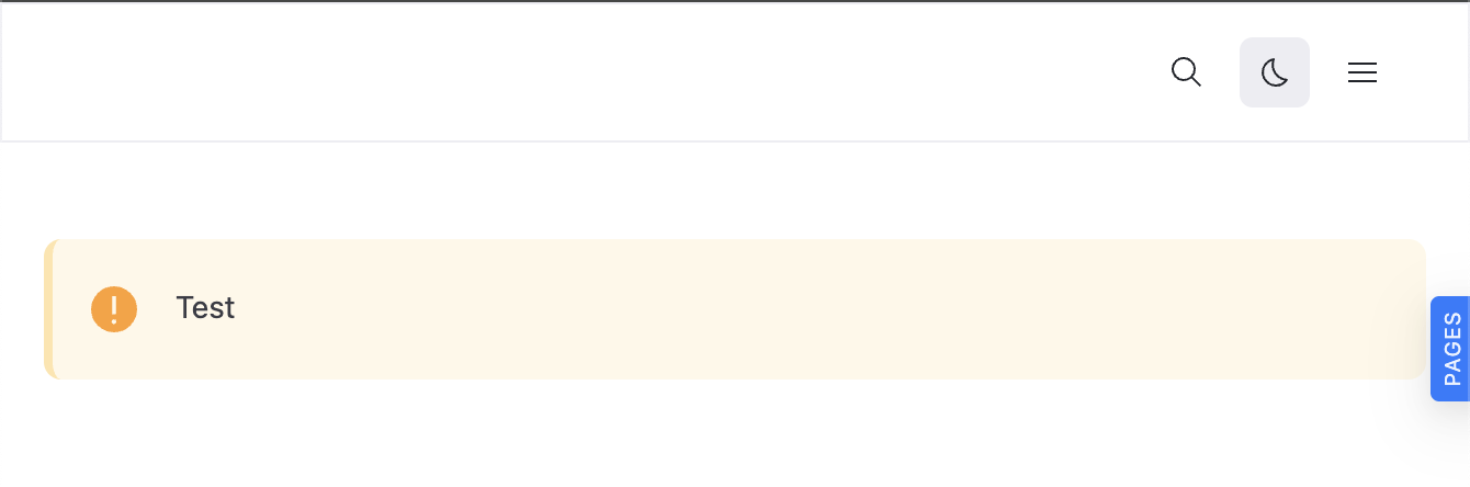
You can import a component directly and use it inside a page.
- Create a page file.
- Import the component.
- Use it on your React page.
test.page.tsx
import * as React from 'react';

import { Admonition } from '@redocly/theme/components/Admonition/Admonition';

export const frontmatter = {
  seo: {
    title: 'Test',
  },
};

export default function () {
  return (
    <div>
      <Admonition type="warning">Test</Admonition>
    </div>
  );
}
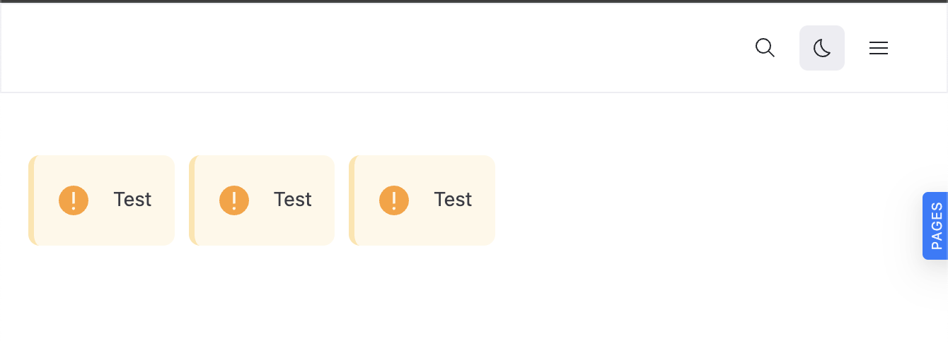
You can also build your own custom components that internally use theme components. This is useful when you want to encapsulate specific logic or structure.
│
├──components/
│   └──InfoRow.tsx
└──test.page.tsxInfoRow.tsx
import * as React from 'react';
import styled from 'styled-components';

import { Admonition } from '@redocly/theme/components/Admonition/Admonition';

export const InfoRow = () => {
  return (
    <Wrapper>
      <Admonition type="warning">Test</Admonition>
      <Admonition type="warning">Test</Admonition>
      <Admonition type="warning">Test</Admonition>
    </Wrapper>
  );
};

const Wrapper = styled.div`
  display: flex;
  flex-direction: row;
  gap: 10px;
`;
- Customize theme components - Learn to wrap and customize built-in components to create reusable, branded versions for your project
- List of customizable components - Browse all available built-in React components that you can customize and extend in your projects
- Customizable icons list - Explore available icon components that you can customize and extend with your own styling and functionality