# Components usage tutorial
There are several ways to use theme components.
Below are some of the most common approaches.
You can find the list of components you can customize [List of customizable components](/docs/realm/customization/react-components/list) and icons [List of customizable icons](/docs/realm/customization/react-components/list/icons).
We use the `Admonition` component as an example to illustrate different integration methods.
## Use components directly on a page
You can import a component directly and use it inside a page.
1. Create a page file.
2. Import the component.
3. Use it on your React page.
### Example
```tsx test.page.tsx
import * as React from 'react';
import { Admonition } from '@redocly/theme/components/Admonition/Admonition';
export const frontmatter = {
seo: {
title: 'Test',
},
};
export default function () {
return (
);
}
```
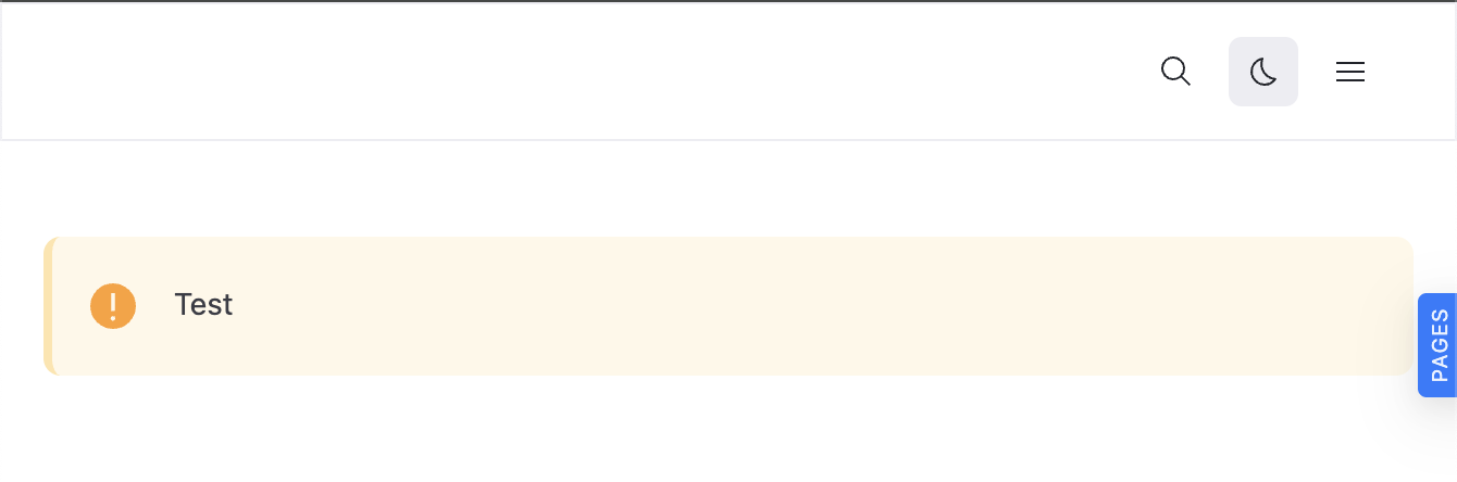
### Rendered output
## Use components inside a custom wrapper
You can also build your own custom components that internally use theme components.
This is useful when you want to encapsulate specific logic or structure.
### Project structure example
```treeview
│
├── components/
│ └── InfoRow.tsx
└── test.page.tsx
```
### Example
Custom component
```tsx InfoRow.tsx
import * as React from 'react';
import styled from 'styled-components';
import { Admonition } from '@redocly/theme/components/Admonition/Admonition';
export const InfoRow = () => {
return (
Test
Test
Test
);
};
const Wrapper = styled.div`
display: flex;
flex-direction: row;
gap: 10px;
`;
```
Page
```tsx test.page.tsx
import * as React from 'react';
import { InfoRow } from './components/InfoRow';
export const frontmatter = {
seo: {
title: 'Test',
},
};
export default function () {
return (
);
}
```
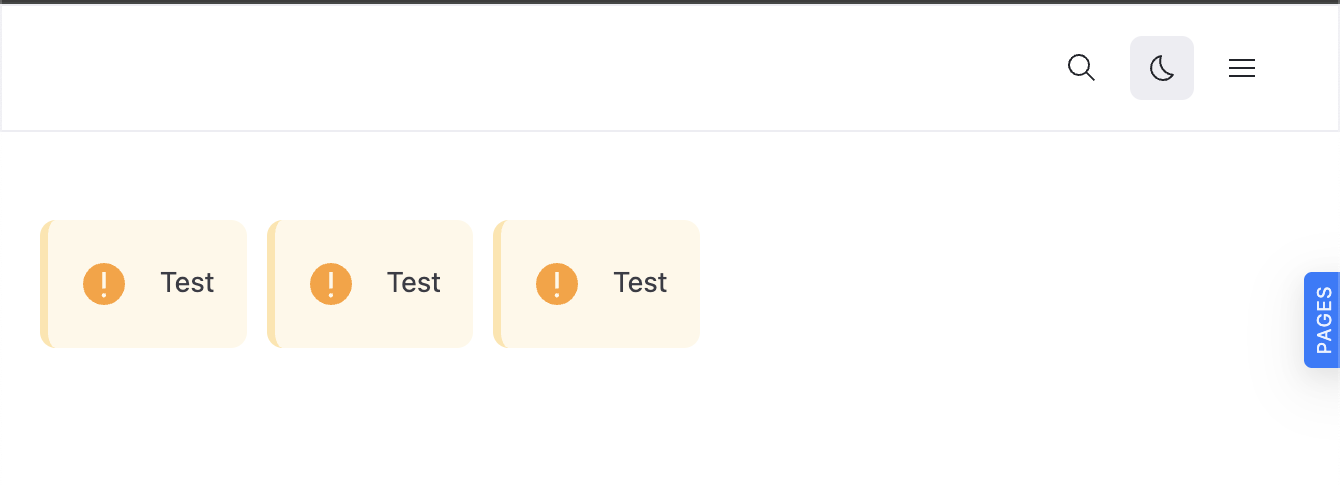
### Rendered output
## Resources
- **[Customize theme components](/docs/realm/customization/react-components/wrap-components)** - Learn to wrap and customize built-in components to create reusable, branded versions for your project
- **[List of customizable components](/docs/realm/customization/react-components/list)** - Browse all available built-in React components that you can customize and extend in your projects
- **[Customizable icons list](/docs/realm/customization/react-components/list/icons)** - Explore available icon components that you can customize and extend with your own styling and functionality