Components usage tutorial
There are several ways to use theme components. Below are some of the most common approaches.
You can find the list of components you can customize List of customizable components and icons List of customizable icons.
We use the Admonition component as an example to illustrate different integration methods.
Use components directly on a page
You can import a component directly and use it inside a page.
- Create a page file.
- Import the component.
- Use it on your React page.
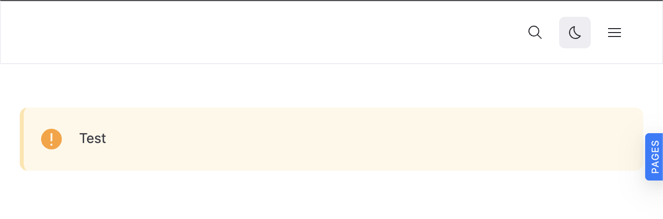
Example
test.page.tsx
import * as React from 'react';

import { Admonition } from '@redocly/theme/components/Admonition/Admonition';

export const frontmatter = {
  seo: {
    title: 'Test',
  },
};

export default function () {
  return (
    <div>
      <Admonition type="warning">Test</Admonition>
    </div>
  );
}
Rendered output
Use components inside a custom wrapper
You can also build your own custom components that internally use theme components. This is useful when you want to encapsulate specific logic or structure.
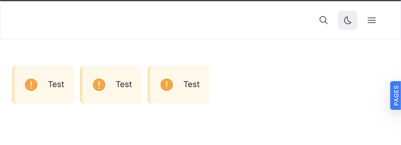
Project structure example
│
├──components/
│   └──InfoRow.tsx
└──test.page.tsx
Example
InfoRow.tsx
import * as React from 'react';
import styled from 'styled-components';

import { Admonition } from '@redocly/theme/components/Admonition/Admonition';

export const InfoRow = () => {
  return (
    <Wrapper>
      <Admonition type="warning">Test</Admonition>
      <Admonition type="warning">Test</Admonition>
      <Admonition type="warning">Test</Admonition>
    </Wrapper>
  );
};

const Wrapper = styled.div`
  display: flex;
  flex-direction: row;
  gap: 10px;
`;
Rendered output
Resources
- Learn how to customize theme components.
- Discover components you can customize in List of customizable components.
- Discover icons you can customize in List of customizable icons.