login
Attention
Requires an OpenID Connect Identity Provider configured.
Usage
If your portal content is protected behind a login, you can add a login component to the portal navbar. The login component is disabled by default. To enable it, add the login section to the top level of the siteConfig.yaml file.
Related options
Portal login and authentication settings must be configured in the auth section for on-premise deployments. Workflows deployments must have an OIDC SSO identity provider configured and attached to the project's access controls. You can customize some elements of the login component in the components > login section of the developer portal theme
Options
| Option | Description |
|---|---|
label | Specifies the default login text displayed in the portal navbar when the user is not logged in. |
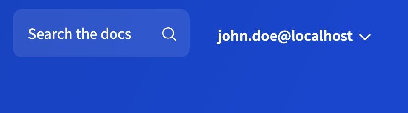
menu | Defines the contents of the menu that opens when the login button is selected in the portal navbar. The menu object accepts a structure similar to the nav section, where every item must have a name (defined by label) and a link (either to a page in the portal project or to an external resource as href). An optional separatorLine property is supported in the menu object. Set it to true to display a horizontal line between menu items. To allow users to log out of the portal, you must add logout: true to a menu item. The logout item can have an optional link property. Use the link property to specify a custom URL where the users are redirected after they log out. By default, the only item in the menu is the logout item (labeled "Sign out"). |
userAvatar | Sets the user avatar image displayed in the portal navbar when the user is logged in. If set to false, then userLabel must be configured. Both options can be configured at the same time. The userAvatar object accepts two options: claim (must map to a claim from the IDP token that is used as the avatar image) and fallbackLettersClaim (must map to a claim from the IDP token that is used to show a two-letter text version if the avatar image is undefined or unavailable). |
userLabel | Sets the text that displayed instead of label when the user is logged in. If set to false, then userAvatar must be configured. Both options can be configured at the same time. The userLabel object accepts two options: claim (must map to a claim from the IDP token that is used to indicate which user is logged in) and fallback (any custom text that is used if the information from the token is unavailable). |
Examples
seo:
  title: Example Developer Portal
  description: Learn how to work with Example APIs
login:
  label: Sign in
  userAvatar:
    claim: picture
    fallbackLettersClaim: fullName
  userLabel:
    claim: email
    fallback: '<unknown user>'
  menu:
    - label: Profile
      page: profile.mdx
    - separatorLine: true
    - label: Sign out
      logout: true
      link: 'https://your_domain/v2/logout?client_id=YOUR_CLIENT_ID&returnTo=LOGOUT_URL'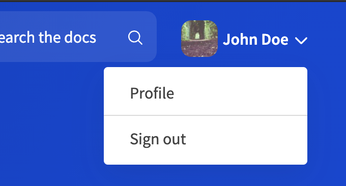
seo:
  title: Example Developer Portal
  description: Learn how to work with Example APIs
login:
  label: Sign in
  userAvatar:
    claim: picture
    fallbackLettersClaim: fullName
  userLabel: false
  menu:
    - label: Sign out
      logout: true
Login component with userAvatar only
Login component with userLabel only