Customize navbars and footers
The developer portal beta is approaching end of life.
Use Realm and Reunite instead. Read the migration guide.
Redocly Developer portal supports optional navbar and footer elements that you can customize to help your readers access the information they need. You can control the two main aspects of these elements:
- Navbar and footer contents - by modifying the siteConfig.yaml file
- Navbar and footer appearance - by modifying the theme.ts file
This guide covers the basic customization steps for your portal navbar and footer.
Portal navbar
To display a top navigation bar in your portal, you must define its contents in the nav section of the siteConfig.yaml file. If this section is not present in your siteConfig.yaml file, the navbar is not visible in the portal.
Modify navbar contents
The contents of your portal navbar are displayed in the same order as they are listed in the siteConfig.yaml file, from left to right.
Your portal navbar can contain links to internal portal pages or to any external resource. To create internal links, use the page key with the path to an internal file as the value. For external links, use the href key with the external page URL as the value. It's recommended to enclose the URLs in quotation marks.
Every link in the navbar must have a label assigned to it. The label contents are displayed in the navbar as the link text.
Example siteConfig.yaml file with a nav section
seo:
  title: Example Developer Portal
  description: Learn how to work with Example APIs
nav:
  - label: Training exercises
    page: developer-portal/index.md
  - label: Example page
    page: developer-portal/markdown.md
  - label: External docs
    href: 'https://google.com'
The result looks as follows:

Enable portal search
To enable the search functionality in your portal, set search to true anywhere within the nav section. Removing this option or setting it to false disables the search functionality altogether.
nav:
  - label: Training exercises
    page: developer-portal/index.md
  - label: Example page
    page: developer-portal/markdown.md
  - label: External docs
    href: 'https://google.com'
  - search: true
In the example above, search is placed at the end of the nav list, so that it is shown to the right of the links in the navbar.
Place it in the beginning for it to appear on the left:
nav:
  - search: true
  - label: Training exercises
    page: developer-portal/index.md
  - label: Example page
    page: developer-portal/markdown.md
  - label: External docs
    href: 'https://google.com'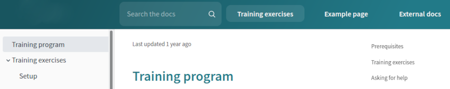
Add custom icons to navbar links
Every link in the navbar can have an optional custom icon. This icon is displayed inline in the navbar, before the link text.
To add a custom icon to a link, use the icon key and provide the path to the icon file in siteConfig.yaml like in the following example:
nav:
  - label: Training exercises
    page: developer-portal/index.md
  - label: Example page
    page: developer-portal/markdown.md
  - label: Example with an icon
    page: developer-portal/search.md
    icon: images/redocly-icon-white.png
  - label: External docs
    href: 'https://google.com'
  - search: true
Add a logo to the navbar
To display your logo in the portal navbar, you must:
add some links to the navbar in the
navsection of the siteConfig.yaml fileprovide the path to the logo image file in the top level of the siteConfig.yaml file
By default, the logo is displayed in the left side of the navbar, above the sidebar.
Example siteConfig.yaml file with a logo and nav section
seo:
  title: Example Developer Portal
  description: Learn how to work with Example APIs
logo:
  image: ./images/logos/logo-example.png
nav:
  - label: Training exercises
    page: developer-portal/index.md
  - label: Example page
    page: developer-portal/markdown.md
  - label: Example with an icon
    page: developer-portal/search.md
    icon: images/redocly-icon-white.png
  - label: External docs
    href: 'https://google.com'
  - search: true
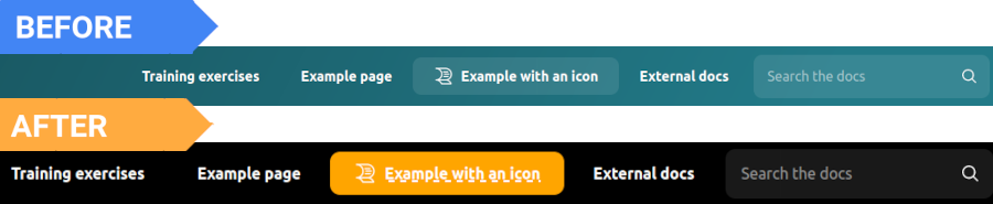
Customize the navbar theme
To change the appearance of your portal navbar, modify the theming options in the theme.ts file in the root of your developer portal project.
All color values in the theme.ts file can be provided in any of the common color formats (hexadecimal value, RGB, HSL, human-friendly color names).
Change the navbar background color
The portal navbar supports three types of background color customization:
- plain color
- single-color gradient
- two-color gradient
For a plain navbar background, set the same value for colors.navbar.main and colors.navbar.gradient theming options. This disables the gradient.
export const defaultTheme = {
  colors: {
    tonalOffset: 0.2,
    navbar: {
      main: '#227a88',
      gradient: '#227a88',
    },
  },
};
For a single-color gradient, set only the colors.navbar.main. This generates a left-to-right linear gradient from the specified color.
For a gradient transition from one color to another, set different values for colors.navbar.main and colors.navbar.gradient. Specified colors are used as color stops in a left-to-right linear gradient.
export const defaultTheme = {
  colors: {
    tonalOffset: 0.2,
    navbar: {
      main: '#227a88',
    },
  },
};
Change the color and font of navbar items
The option colors.navbar.contrastText controls the color of navbar links. Use the options navbar.activeBgColor and navbar.activeTextColor to change the background and text colors of active (selected) links in the navbar.
The navbar.activeTextDecoration option lets you add emphasis to selected links in the navbar by using standard text-decoration CSS property syntax.
export const defaultTheme = {
  colors: {
    navbar: {
      main: 'black',
      contrastText: 'white',
    },
  },
  navbar: {
    activeBgColor: 'orange',
    activeTextColor: 'white',
    activeTextDecoration: 'dashed underline',
  },
};
Navbar links don't have dedicated font-related theming options, so you can't control their fonts directly. By default, navbar links inherit the font family from the typography.headings.fontFamily option. Modifying this option changes the navbar link font, but it also affects other elements in the portal.
export const defaultTheme = {
  typography: {
    headings: {
      fontFamily: 'Ubuntu',
    },
  },
};
Adjust the spacing between navbar items
The options navbar.marginHorizontal and navbar.marginVertical control the spacing between items in the navbar (links, search bar - if enabled).
Use the option navbar.borderRadius to set rounded corners for selected navbar links and for the search bar.
To add more space between the navbar and the text in the main content area, use the components.contentWrapper.paddingVertical option. Keep in mind that this option also controls the spacing between the main content area and the footer.
export const defaultTheme = {
  components: {
    contentWrapper: {
      paddingVertical: '70px',
    },
  },
  navbar: {
    borderRadius: '20px',
    marginHorizontal: '10px',
    marginVertical: '10px',
  },
};
Modify the search icon
The components.search object lets you change the search icon color and replace the default search icon with a custom one. You must format your custom icon as a set of SVG properties inside <svg> ... </svg> tags. The search functionality must be enabled in the portal for these theming options to apply.
export const defaultTheme = {
  components: {
    search: {
      icon: '<svg xmlns="http://www.w3.org/2000/svg" fill="#000" viewBox="0 0 451.847 451.847" width="12px" height="12px" ><path d="M225.923 354.706c-8.098 0-16.195-3.092-22.369-9.263L9.27 151.157c-12.359-12.359-12.359-32.397 0-44.751 12.354-12.354 32.388-12.354 44.748 0l171.905 171.915 171.906-171.909c12.359-12.354 32.391-12.354 44.744 0 12.365 12.354 12.365 32.392 0 44.751L248.292 345.449c-6.177 6.172-14.274 9.257-22.369 9.257z" /></svg>',
      iconColor: 'orange',
    },
  },
};
Adjust the logo image size
The logo object lets you control how the logo image scales within the navbar. Note that modifying these options may result in distortion of the logo image. Changing the logo image height also affects the total height of the navbar.
export const defaultTheme = {
  logo: {
    height: '100px',
    maxHeight: '100%',
    maxWidth: '120%',
    }
  }
}
Portal footer
To display a footer (bottom navigation bar) in your portal, you must define the footer contents in the footer section of the siteConfig.yaml file. If this section is not present in your siteConfig.yaml file, the footer is not visible in the portal.
Modify footer contents
The contents of your portal footer are displayed in the same order as they are listed in the siteConfig.yaml file.
Your portal footer can contain:
- links to internal portal pages or to any external resource.
- custom copyright text. By default, this text is always displayed at the very bottom of the footer, under the links.
To create internal links, use the page key with the path to an internal file as the value. For external links, use the href key with the external page URL as the value. It's recommended to enclose the URLs in quotation marks.
Every link in the footer must have a label assigned to it. The label contents are displayed in the footer as the link text.
Footer links should be grouped into columns. Each group is displayed as one column, and can have a custom title.
Example siteConfig.yaml file with a footer section
footer:
  copyrightText: Copyright © Redocly 2019-2021. All rights reserved.
  columns:
    - group: Legal
      items:
        - label: Terms of Use
          href: 'https://redocly.com/subscription-agreement/'
        - label: Privacy Notice
          href: 'https://redocly.com/privacy-policy/'
        - label: Cookie Notice
          href: 'https://redocly.com/privacy-policy/'
    - group: Support
      items:
        - label: FAQ
          page: faq.md
        - label: Contact us
          page: contact.md
Custom icons for links are supported only in the portal navbar, not in the footer. You cannot use the icon key with footer links.
Customize the footer theme
To change the appearance of your portal footer, modify the theming options in the theme.ts file in the root of your developer portal project.
All color values in the theme.ts file can be provided in any of the common color formats (hexadecimal value, RGB, HSL, human-friendly color names).
Change the footer background color
Use the colors.footer.main option to set a custom background color for the footer.
export const defaultTheme = {
  colors: {
    footer: {
      main: 'black',
    },
  },
};
Change the color and font of footer items
The colors.footer.contrastText option controls the color of all items in the footer, including links, column names, and copyright text.
export const defaultTheme = {
  colors: {
    footer: {
      contrastText: 'orange',
      main: 'black',
    },
  },
};
Footer items don't have dedicated font-related theming options, so you can't control their fonts directly. By default, footer links inherit the font family from the typography.headings.fontFamily option, and the size from typography.fontSize. Copyright text inherits the font family from typography.fontFamily, and the size from typography.fontSize.
Modifying these options changes the footer text, but it also affects many other elements in the portal.
export const defaultTheme = {
  typography: {
    fontFamily: 'serif',
    fontSize: '18px',
    headings: {
      fontFamily: 'Ubuntu',
    },
  },
};
Open navbar and footer links in a new tab or window
You can make navbar and footer links open in a new browser tab or window by adding special properties to each link in the siteConfig.yaml file.
For internal links (page key), add the external: true property. For external links, use either external: true or the target: _blank property.
Links with external: true automatically get an indicator icon displayed next to the link text. This applies to internal and external links, in navbar and footer alike.
Example siteConfig.yaml file with nav and footer sections
nav:
  - label: Example with an icon
    page: developer-portal/search.md
    icon: images/redocly-icon-white.png
  - label: External docs
    href: 'https://google.com'
    external: true
  - search: true

footer:
  - group: Legal
      items:
        - label: Terms of Use
          href: 'https://redocly.com/subscription-agreement/'
          target: _blank
        - label: Privacy Notice
          href: 'https://redocly.com/privacy-policy/'
          external: true
        - label: Cookie Notice
          href: 'https://redocly.com/privacy-policy/'
          external: true
In the screenshots below, note how the link with target: _blank doesn't have the indicator icon, while all links with external: true have the icon.
Portal navbar with a link that opens in a new tab

Portal footer with a link that opens in a new tab

If your link is created as a JSX element in the React component, you can add inline style: target="_blank".
Example: <Link target="_blank" to={item.link}>{item.label}</Link>
Further customization
The navbar and footer can be completely customized by creating React components that override the default components.
If you're interested, contact us.