The table tag enables you to create tables using a list-based syntax that allows for injection of rich content, like bulleted lists and code samples. You can also add tables using HTML syntax, but the table tag allows for richer content and is easier to format.
Use the table tag to add tables with rich content to your documentation.
Example syntax:
{% table %}

- Option
- Type
- Description

---

- hide
- boolean
- Disables breadcrumb links in the project when set to `true`.\
  Default value: `false`

---

- prefixItems
- [[Breadcrumb object](#)]
- A list of breadcrumb links to always be displayed first.

{% /table %}| Option | Type | Description |
|---|---|---|
| width | string | Sets the width of the table row. |
| align | string | Sets the text alignment to either center, left, or right. Default value: left |
| colspan | number | Sets the column and row span. |
The following examples illustrate using rich text in Markdoc tables:
| Type | Description | Example |
|---|---|---|
Sentiment |
|  |
Mood |
|  |
Rating |
|  |
Scale |
|  |
Comment |
|  |
Example table with bullets syntax:
{% table %}
- Type
- Description {% width="40%" %}
- Example
---
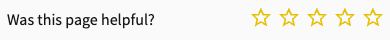
- Sentiment
- - Includes a question or statement with a thumbs-up and thumbs-down icon.
- This is the default feedback form and displays without configuration.
- Users can express either a positive or negative reaction to the page.
- {% img
src="../images/sentiment-01.png"
alt="Screenshot of the sentiment feedback form"
withLightbox=true
/%}
---
- Mood
- - Includes a question or statement with a smiling-face, neutral-face, and frowning-face icon.
- Users can express a positive, negative, or neutral review of the page.
- {% img
src="../images/mood-01.png"
alt="Screenshot of the mood feedback form"
withLightbox=true
/%}
---
- Rating
- - Includes a question or statement with five star icons.
- Users can rate a page from one to five stars.
- {% img
src="../images/rating-01.png"
alt="Screenshot of the rating feedback form"
withLightbox=true
/%}
---
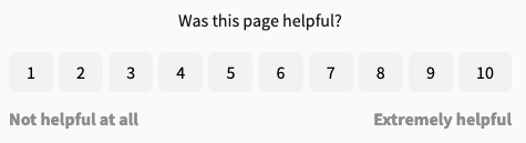
- Scale
- - Includes a question or statement, left-hand side and right-hand side text labels, and buttons for numbers 1 - 10.
- Users can rate a page from one to ten.
- {% img
src="../images/scale-01.png"
alt="Screnshot of the scale feedback form"
withLightbox=true
/%}
---
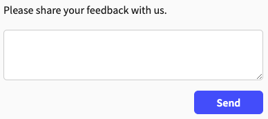
- Comment
- - Includes a text label and text input.
- Users can use the text field to express their thoughts about the page in a free-form way.
- {% img
src="../images/comment-01.png"
alt="Screenshot of the comment feedback form"
withLightbox=true
/%}
{% /table %}| Option | Type | Description |
|---|---|---|
| languages | [language object] | REQUIRED. Array of language objects, one per language. The samples are displayed in the order that they are listed. Default array value is:[
{ lang: curl },
{ lang: JavaScript },
{ lang: Node.js },
{ lang: Python },
{ lang: Java },
{ lang: C# },
{ lang: PHP },
{ lang: Go },
{ lang: Ruby },
{ lang: R },
{ lang: Payload }
] |
| skipOptionalParameters | boolean | Excludes optional parameters (cookies, headers, query params) from the generated code samples. Defaults to false. |
Example table with code sample syntax:
{% table %}
- Option
- Type
- Description
---
- languages
- [language object]
- **REQUIRED.**
Array of language objects, one per language.
The samples are displayed in the order that they are listed.
Default array value is:
```javascript
[
  { lang: curl },
  { lang: JavaScript },
  { lang: Node.js },
  { lang: Python },
  { lang: Java },
  { lang: C# },
  { lang: PHP },
  { lang: Go },
  { lang: Ruby },
  { lang: R },
  { lang: Payload }
]
```
---
- skipOptionalParameters
- boolean
- Excludes optional parameters (cookies, headers, query params) from the generated code samples.
Defaults to `false`.
{% /table %}| Heading 1 | Heading 2 |
|---|---|
| Row 1 Cell 1 | Row 1 Cell 2 |
| Row 2 Cell 1 | Row 2 Cell 2 |
Example table without headings syntax:
{% table %}
---
- Row 1 Cell 1
- Row 1 Cell 2
---
- Row 2 Cell 1
- Row 2 cell 2
{% /table %}Tables are especially useful for displaying complex data in an organized way.
Do not use tables for layout
It is best to use CSS for styling if you need to place items side-by-side on the page, not tables.
Use a list if only one column
If you only have a single column, a list is probably a better way to display the information.
Include an introductory sentence
Introduce tables with an explanatory sentence that describes the significance of the table.
- Customize table styles - Learn to style tables with CSS variables, custom classes, and mode-specific styling for enhanced visual presentation
- Markdoc overview for technical writers - Learn how to use Markdoc in your documentation
- Markdoc tags - See the full list of supported Markdoc tags