# Custom Styling
You can customize the styling and theme of your documentation using CSS.
This page provides an in-depth explanation of how styling works in a Redocly project and how CSS variables can be used to create flexible, maintainable styling rules for your documentation.
## Customize your documentation
The behavior and appearance of your documentation is controlled by a customizable theme. There are two types of customizations:
1. **Functional** - The [Redocly configuration file](/docs/realm/config) can be used to enable, disable, or customize features in your documentation.
2. **Aesthetic** - The visual appearance of your documentation, such as the colors, fonts, and spacing, can be customized using CSS styling rules.
### The role of @theme/styles.css
Custom styling rules must be defined inside your project's `@theme/styles.css` file.
During the rendering of your docs, the styles in this file are applied to all the pages in your project.
## Fundamentals of styling
This section contains foundational styling knowledge that will help style your documentation more effectively.
### Core CSS concepts
Some concepts in CSS provide important context for how styling works in your Redocly documentation.
For a more comprehensive explanation, we recommend reading MDN's page on [CSS basics](https://developer.mozilla.org/en-US/docs/Learn/Getting_started_with_the_web/CSS_basics).
#### Selectors
Selectors are used to target the HTML elements you want to style.
There's many types of selectors; they can be based on IDs, classes, element names, attributes, and more.
details
summary
See example: Selectors
Here are some of the most basic CSS selectors:
```css Selectors
#some-element {
/* ID selector */
}
.section-heading {
/* class selector */
}
h2 {
/* tag selector */
}
```
#### Properties and values
Properties are the aspects of the element you want to change.
Values are the settings for those properties.
They're used together inside the selector.
details
summary
See example: Properties and values
```css Properties and values
h1 {
/* property: value */
color: blue;
font-size: 26px;
}
```
#### Inheritance
Some (but not all) property values set on parent elements are inherited by their child elements.
That means styling rules are inherited by an element's descendent.
details
summary
See example: Inheritance
The following example sets the text color to red inside the body tag selector:
```css @theme/styles.css
body {
color: red;
}
```
When the following HTML renders, the text is red:
```html index.html
```
The text is red because the `p` tag *inherited* the styling rule defined on the `body` tag.
#### The role of specificity
CSS means Cascading Style Sheets.
It's named that because the styles "cascade" downward (yes, like a waterfall) to other elements, but CSS doesn't just flow downwards.
It cascades in order of importance, which is controlled by the *specificity* of your selector.
When styling rules conflict, the rule with higher specificity is always applied.
details
summary
See example: Cascading styles and specificity
Consider the following CSS, which changes text color:
```css @theme/styles.css
h2 {
color: green;
}
.section-heading {
color: yellow;
}
```
With this styling, `` elements on the page have green text.
However, because class is a more specific selector, that style is overridden and the text is yellow.
```html index.html
Green heading
Yellow heading
```
### CSS variable concepts
CSS variables, aka "custom properties", are a way to store values you want to reuse throughout your CSS.
They have some major benefits when it comes to styling your documentation: reusability, dynamic updates, theming, and overall modularity.
#### CSS variable syntax
CSS variables are defined as custom properties with a `--` prefix and used with the [var() function](https://developer.mozilla.org/en-US/docs/Web/CSS/var).
The `var()` function accepts a custom property and resolves to that property's declared value.
details
summary
See example: CSS variable syntax
```css @theme/styles.css
:root {
--primary-heading-bg-color: #5b4ccc;
}
th {
background-color: var(--primary-heading-bg-color);
}
```
CSS variables can *only be used as values*.
They don't work as property names, classes, or in any other context.
#### Fallback values
The `var()` function accepts a second parameter: a fallback value.
The fallback value provides a default option in case the variable isn't set or can't resolve.
details
summary
See example: Fallback values
In the following example, the text color in the `.display-banner` isn't defined, so it falls back to black.
```css @theme/styles.css
:root {
--text-color-primary: #1a1c21;
}
.display-banner {
color: var(--text-color-secondary, #000000 );
}
```
Fallback values ensure your styling works when a CSS variable isn't defined or [supported by the browser](https://caniuse.com/css-variables).
Use them to define default styles for older systems or unexpected situations.
#### Reusability
One of the biggest benefits of CSS variables is their reusability.
You define a value once, then reuse it multiple times, providing consistency across your styles.
details
summary
See example: Reusability
The following example defines variables in the `:root` selector, then reuses them in other selectors:
```css
:root {
--background-color: #3498db;
--text-primary: #161616;
--text-secondary: #525252;
--heading-margin-top: 1.25em;
}
h1 {
color: var(--text-primary);
margin-top: var(--heading-margin-top);
}
body {
color: var(--text-color-secondary, #000000);
background-color: var(--background-color, #FFFFFF);
}
```
#### Scope and inheritance
CSS variables are scoped to the selector where they're defined, but [CSS inheritance](#inheritance) rules also apply to CSS variables.
When a variable is defined within a selector, it's *inherited* by the child elements unless overridden.
Inheritance allows you to create relationships between variables to make your styling more consistent and maintainable.
details
summary
See example: Scope and inheritance
The following example defines a variable in the `:root` selector, then uses it to style children elements:
```css CSS variable inheritance
:root {
--base-font-size: 16px;
}
body {
font-size: var(--base-font-size);
}
h1 {
font-size: calc(var(--base-font-size) * 2);
}
```
## Custom styles in Realm
Realm provides a comprehensive set of pre-defined [CSS variables](#css-variable-concepts), which can be overridden in your `@theme/styles.css` file.
You can define custom CSS rules, too, but we recommend using the CSS variables where possible.
Styling with CSS variables has two distinct benefits for styling your documentation:
1. Smaller, one-off customizations are more streamlined and provide more control.
You can override an element-specific variable or something farther up the inheritance chain.
2. Theme-level styling customizations are more consistent and maintainable.
### CSS variables in Realm
There are two ways to identify Realm's CSS variables:
1. Looking at the [list of CSS variables](/docs/realm/branding/css-variables) in our documentation.
2. [Using browser developer tools](#find-variables-with-browser-dev-tools) to inspect elements.
For practical examples of using CSS variables, see the [custom styles guide](/docs/realm/branding/customize-styles) which demonstrates comprehensive styling setups.
CSS variable overrides will typically go inside the `:root` or `:dark` selector (see Color mode), but some may be scoped to specific classes.
The following example shows the format:
```css @theme/styles.css
:root {
--text-primary: #656255;
--heading-text-color: #000000;
}
:dark {
--text-primary: green;
--heading-text-color: #FFFFFF;
}
/* Scoped to button-primary class for both color modes */
.button-primary {
--button-active-border-color: red;
}
/* Scoped to button-primary in light mode */
:root .button-primary {
--button-color: #00008B;
}
/* Scoped to button-primary in dark mode */
:dark .button-primary {
--button-color: #ADD8E6;
}
```
### Find variables with browser dev tools
When styling Realm, the browser developer tools can help you identify which CSS variables to use.
These tools allow you to inspect HTML elements and see which CSS variables are applied.
You can also explore how the variable may be nested.
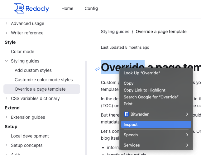
1. Open developer tools - Right click the element you're interested in and select **Inspect** or press **F12**.

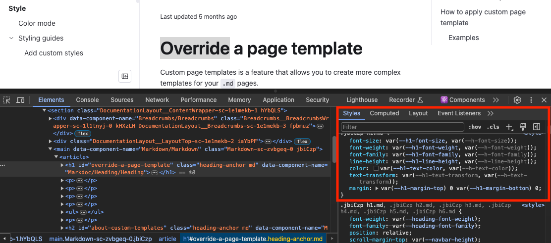
2. View styles - In the **Elements** panel, you'll see the styles applied to the selected element.

3. Identify variables - Find the CSS variable to override to apply your styling.
You can also click the variable to explore it's relationship to other variables.
### Nested CSS variables
Realm's CSS variables can be described as "nested".
A core, low-level set of variables are defined around things like colors, fonts, and spacing, which are then used to create other variables.
There are multiple layers of abstraction.
When overriding a variable, you need to consider the relationship with other variables or your styling change could impact a downstream variable.
For example, let's say we want to change the background color of the in-browser error message.
We used dev tools to identify the variable, `background: var(--detailed-error-message-background);`.
Here's how that variable is nested:
```css
:root {
--bg-raised: #fafafa;
--code-block-background-color: var(--bg-raised);
--detailed-error-message-background: var(--code-block-background-color);
}
```
Overriding variables closer to the root value are theme-level changes.
The styling change will trickle down to any nested variables.For example, changing the value for either `--bg-raised` or `--code-block-background-color` will also change the styling of any variables built on top of them.
Overriding variables at the bottom of the nesting hierarchy will impact something more specific.
For example, overriding `--detailed-error-message-background` will only change the styling for the error message background.
### Inheritance-powered styling
Consider the `:root` selector (used in many examples on this page), which applies to the root HTML element.
Variables defined in `:root` are "globally" available because every other HTML element is a child, which means they inherit the CSS variables.
It's the [scope and inheritance](#scope-and-inheritance) behaviors of CSS variables that make this approach to styling so effective for building and managing themes.
CSS variables in Realm are defined on `:root`, which means they're globally available via inheritance.
Overriding the wrong [nested variable](#nested-css-variables) in `:root` can have downstream implications.
However, by overriding that same variable *inside a different scope*, you can ensure predictable, consistent behavior throughout your theme.
For example, let's say we have an element with a custom class called `.blog-display` and we want to style the text color.
This is text is currently styled:
```css
:root {
--color-warm-grey-8: #3b3c45;
--text-color-secondary: var(--color-warm-grey-8);
--base-font-size: 14px;
}
p {
font-size: var(--base-font-size);
color: var(--text-color-secondary);
}
```
One approach is using a class selector and setting the property values:
```css
.blog-display {
font-size: 18px;
color: black;
}
```
This works, but any CSS variables related to `font-size` and `color` are still controlled by `:root`.
If the `.blog-display` class contains other elements styled by those, then our new styles won't match.
When styling a theme, a better approach is to override the lower-level CSS variables inside the scope of the `.blog-display` class:
```css
.blog-display {
--text-color-secondary: black;
--base-font-size: 18px;
}
```
Overriding CSS variables in the correct scope allows you to preserve the relationships between variables and logic defined in the core theme.
## Resources
- **[Custom styles guide](/docs/realm/branding/customize-styles)** - Customize your project's appearance using CSS variables and custom stylesheets for precise brand control
- **[Color mode customization](/docs/realm/branding/customize-color-modes)** - Create custom styling for light and dark modes with mode-specific color schemes
- **[Color mode concepts](/docs/realm/branding/color-mode)** - Understand how the color mode feature works and its implementation using CSS variables
- **[CSS variables reference](/docs/realm/branding/css-variables)** - Complete dictionary of available CSS variables for styling your documentation